

Apple is unable to distinguish the quality of its own retina displays from regular displays.
Summary
Apple's retina displays (e.g. those on the iPad3, aka "new iPad") use 4 times more physical pixels than regular displays (e.g. those on iPad2). Everybody with a grain of common sense would understand that if a retina display has 4 times more pixels, the source images also need to have 4 times more pixels to make use of the retina display's extra pixels. Image C has 4 times more pixels than image A. If you enlarge or "stretch" Image A so that it fills up the same area as image C it will look more blurry. This article will explain in more detail that the very company which pioneered retina displays (Apple) does not understand this as is shown in their very own App Store with an actual example.
 |
|
| A. 132x132 image | |
 |
 |
| B. 132x132 image shown as 264 x 264 | C. 264 x 264 image shown as 264 x 264 |
Full Story - Part 1 - Retina Pixels
For Android things are much simpler, a pixel in the image corresponds with a pixel on the device. Apple made it more complicated than necessary because, as will be proven by this article, they themselves are now confused. Apple uses "retina pixels" consisting of four physical pixels.
So to Apple, the iPad3 has the same number of pixels as the iPad2, it's just that the iPad3 uses retina pixels while the iPad2 uses regular pixels. So an image specified in the coding as 132 x 132 pixels will show up as 1 inch x 1 inch on an ipad2 and iPad3. However, because the iPad3 has 4 times the number of physical pixels, that 1 inch x 1 inch area contains 264 x 264 physical pixels. So if on an iPad3 you use the same 132 x 132 source image as on an iPad 2 it will look the same as on the iPad2 because every retina pixel will be filled up with 4 identical physical pixels (1). If you use a 264 x 264 image, then each of the 4 pixels in every retina pixel will contain additional detail, leading to a sharper image. This is clear from the above example.
(1) Assuming simple nearest neighbor interpolation. Regardless of the interpolation method used (bilinear, bicubic, etc) an upsampled image will always look more blurry.
If the iPad3 was an Android device you would specify the image size as 264 x 264 pixels. But this article is not about coding differences. Bottom line is that retina displays have 4 times more pixels, so to make use of the additional sharpness they can provide, the source images need to be four times more detailed. A video on a TV will only be of HD quality if the both the TV AND the video are of HD quality. What Apple seems to think is that watching a regular video on a HD TV is the same as watching a HD video on a HD TV. Nothing could be further from the truth.
So let's just forget about retina pixels and go by physical pixels for a moment. The iPad2 displays are 1,024 pixels wide and 768 pixels high. The iPad3 has double the pixel density horizontally and vertically. So while the iPad3 display has the same diameter as the one of the iPad2, it is 2,048 pixels wide and 1,568 pixels high. So the iPad2 has 786,432 pixels while the iPad3 has 3,227,648 pixels or 4 times more. That is why apps and graphics displayed on the iPad3 should have 4 times more pixels.
Full Story - Part 2 - Apple after Steve Jobs
It seems however that now that Steve Jobs is no longer there, Apple is not what it used to be. On a macroscopic scale we had the Google Maps disaster, and now also the "purple fringing" issue. On a microscopic scale, details no longer seem to matter either. While Apple is advertising the superior sharpness of its retina displays, Apple itself is unable to see the difference between a retina display and a regular display. Indeed, after more than a month of communication, Apple is still unable to see that the App icons in their own App Store are blurry on the iPad3 because they are not using high res images. In fact, Apple stated "the app icon is displaying as expected on the iPad3 in the App store" which is essentially the same as saying "we are incapable of seeing the difference between an iPad2 and an iPad3 display".
Full Story - Part 3 - Practical Example
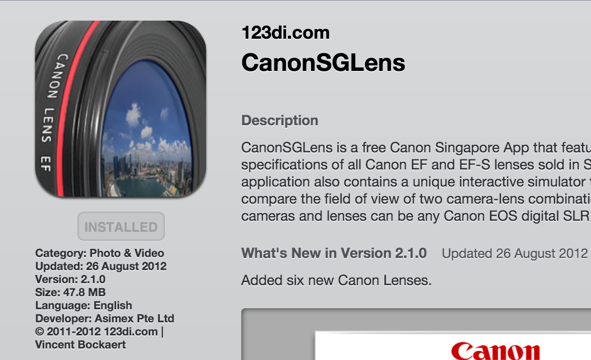
The left side of this page shows how the app icon should look if it is optimized for a retina display (depending on your browser you may have to scroll the page), the bottom right shows how it looks in Apple's App Store now. There is a clear difference in sharpness. If you click on the app icon on the bottom right of this page, you will be connected to the app store to see the real page.
It is *important* that you only click when viewing this page on your iPad3. If you are viewing this page on
computer with a non-retina display, you have to zoom to 200% before clicking on the link. Zooming to 200% will require the image to call up 4 times more pixels, so it simulates a retina display.
In Safari, View > Zoom in twice.
In Windows Explorer, View > Zoom 200%.
In Chrome, zoom to 200%.
You will then clearly see the difference in sharpness between the app icon on the bottom left of this page and the one shown in the app store.
From this example it is clear that Apple is currently still using the non-retina source images (175 x 175 pixels) for the App icons in the App Store to fill up an area of 350 x 350 physical pixels of a retina display. This is strange because developers are asked to provide 1,024 x 1,024 App icons. If you, like Apple, cannot see the difference between the two icons, then you should not invest in a iPad3 but just keep using your iPad2 or iPad1.
App icon as currently shown in the App Store (click on link to see actual app store page, on a computer zoom to 200% first, then compare with image optimized for retina shown on the left):
